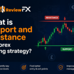


Looking at a candlestick, bar or a line chart for the very first time is both captivating yet confusing. The typical response we hear from newer traders is that it reminds them of a hospital’s heart monitor. While this medical appliance is designed to monitor the fluctuations of a heart, the chart is there to record a security’s price.
Price action, or ‘P.A’ for short, is a term used to note the movement of price. To understand the basics of a price chart, however, knowing the anatomy of a candlestick is essential. Candlesticks are used extensively throughout the trading community and are, in our humble opinion, the more visually striking when compared to a bar or line chart.
The picture above shows how a candlestick formation is read. Each candle typically contains both a high (also known as a ‘wick’), a low (also known as a ‘tail’), an open, close and a body, with each closed candle telling a different story. The wick, assuming that the candle being studied is from the daily timeframe, displays how high the instrument traded throughout the day. By the same token, the tail demonstrates how low price managed to trade on the day. In the event that the newly-painted candle closes above the prior day’s close, then a bullish/positive candle would be seen (green). Likewise, if the day’s trading concludes with price action closing lower than the previous day’s closing point, the candle will then be considered bearish/negative (red).
For those of you completely new to the world of trading, a timeframe simply refers to the period that a trader selects to conduct his/her trading on. Markets provides the following timeframes on their MT4 platform to view price action:
The ‘M1’, or 1 minute timeframe, is the smallest timeframe a trader can view price action here, where candlesticks come in thick and fast, printing a fresh candlestick every minute. The ‘MN’, or monthly timeframe, is the largest scale one can view candle action here, which provides one with a freshly-painted candle each month. Of course, as demonstrated in our very own daily technical reports, one does not need to solely rely on one timeframe. A trader has the option of adopting a multi-timeframe style, which, in our belief, helps one establish more of a concrete picture of the market as a whole.
The gold stars are used to denote ‘swing lows’ and the red stars are there to signify ‘swing highs’. You’ll often here these terms thrown around forums when discussing technical analysis. Put simply, they are the extreme points that are visible on a particular timeframe. As can be seen from the above chart, it’s relatively simple to recognize them visually. However, they are, without a doubt, essential concepts one needs to grasp in order to read the charts correctly.
Knowing what a timeframe is and how to read a candlestick chart, nevertheless, is not enough. There is a plethora of price action patterns that traders use to analyze the markets. In order not to overwhelm our newer traders, we’ve kept this article relatively simple. In part 2, we’ll look to dive into more juicy aspects of price action and touch on how one could potentially use this in their trading.